


Python pandas is one of the most important tools to have in your toolbox as a Data Scientist.
We’re referring to the framework used for tabular analysis. The name is derived from “panel data” a term closely associated with multidimensional structured data sets.
I have thought of an interesting use case for Pandas and that is stock market analysis.
We want to analyze the stock prices of my 5 favorite car manufactures, and see all the interesting cool things we can do with Pandas.
Setting Up Our Environment
Before diving into any project it is important to have our toolbox ready, this is mainly setting up the environment.
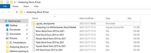
We will create a folder and we will name ours ‘Analysing_Stock_Prices’, open our Anaconda prompt as an administrator and cd into the folder ‘Analysing_Stock_Prices’, and open the Jupyter Notebook.

Select New and Python 3 (Ipykernel) and get your Jupyter Notebook ready.
Getting Live Data From Yahoo Finance
We will be using Pandas data reader, to get live data for us to work with and analyze.
We will start by importing the pandas data reader and the date-time module, we will use the data reader for remote data access and the datetime module for specifying the begin and end date times.

Then we need to specify to the DataReader how we want our data, meaning the start and end dates.

We will use BMW as a litmus, to test out Pandas reader and the DateTime module.

Above we have our variable bmw, we set it to the Pandas data reader by calling web.DataReader and pass in “BMW.DE” as the stock name for BMW, our source is yahoo and we put in our start and end dates. Then we call bmw and check our data.

Above we have a summary of the important data from 2015 to 2021. We want the first set of results we will use the .head() method and for the last bit of results, we can use the .tail() method.


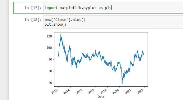
Now we want the data of when the BMW stocks closed, which is data from 2015 to 2021, we also want to plot out this data. We will first import matplotlib as the alias plt.

Then we need to read the closing stocks and plot them using matplotlib.

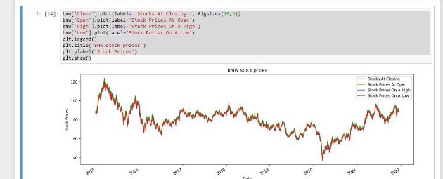
Let’s make our data look more interesting, we know the finance guys want to see, colors, labels, bigger shapes and interactive data.

We are sure our environments are fully set up, let’s dig in.
Tesla Vs VW Vs BMW Vs Daimler Vs Ford Vs Toyota Vs Nissan
German car manufacturers against their American counterparts Vs the Japanese carmakers.
Before we get started, we also need a Python library called NumPy which we use when working with arrays and matrices.

Then we need to tell the Data Reader to get us our different stock

We can also save the stock in CSV files to complement our Jupyter Notebook.

We name the variable as per above for the different car manufacturers, then we use the .to_csv() method and pass in the Title of the CSV file in the brackets. Then we can check our folder named Analysing_Stock_Prices.
Analyzing The Start Data
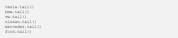
To check starting data, we use the .head method, now let’s do it for all the car manufacturers we have brought in.

And the .tail() method for viewing the bottom sectioned data, which is the latest data.
And we want to plot all the data of the car manufacturers at open and at close.
We will begin with ‘Close’.


Then move on to ‘open’ and plot the outcome.
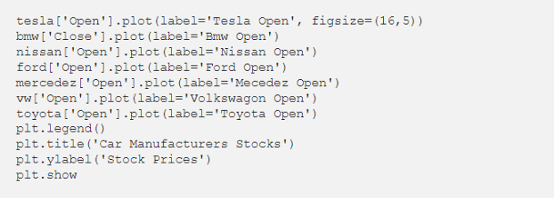

As we can see for both the ‘Open’ and ‘Close’ from mid-2020, Tesla has been dominating the other car manufacturers, we can see this by the blue wave. Let’s continue playing with our data and see if Tesla really dominates.
I want to see the volume of all these stocks.


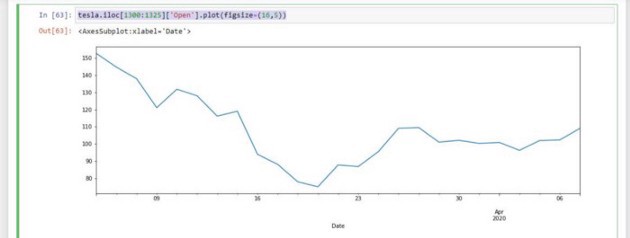
Let’s analyze the above plot, we see that Tesla began to peak in mid-2020, what caused the spike in Tesla stock? We will use the iloc method for this. The iloc method is used when we want to index at a certain point using Pandas.

So we want to see the Tesla ‘Open’ stock from mid-2020 and we are just enlarging our diagram, by specifying the figsize.

But we want a clearer image of the year 2020 only.

The volumes increased and the stock price decreased. Companies drop the stock and the volume increases.
Analyzing The Market Cap
We want to check which of the car manufacturers is more valuable than the other. We do not want to rely simply on the time series data.
Our current data can not help us analyze this, that however won’t stop us from using tricks within mathematics to get that data. We will use some basic math to get the total units of the stock present.
We will use the open price and the Volume, our end goal is to get the total money traded.
So we want to add a column for the total traded, for each car manufacturer.
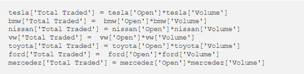
Let’s check with Nissan, Tesla and VW if we have the column added.

Now let’s plot our ‘Total Traded’ for all car manufacturers.

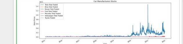
The time series graph shows us that there was a huge amount of Total Traded for Tesla in 2021. So we want the position of that spike.

We get position 1502 and we want the iloc on 1502.


Well as I said before we cannot rely on the time series representation as it is sometimes misleading. The peak happened on December the 18th 2020, quite interesting stuff.
Moving Average
We want to read each manufacturer separately as it seems at this moment Tesla is winning, but we need need to analyze everything in order to make informed decisions. We will just work with the Close for now.

Now that we have plotted each individually, we want to get rid of the noise, smoothen out our diagrams a little bit.
We will begin by creating another new column and we will call it moving average 60. The 60 represents the samples we will be analyzing, 60 dates, a two-month analysis is quite fair enough. We can use VW as our sample for this, but in the Notebook, I have done all the car manufacturers for you guys.

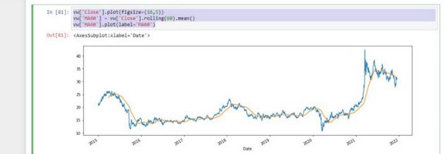
The noise has been smoothened out a bit, and we can increase our moving average to maybe 300.

When the window size is too high we miss out on trends, it’s always better to consume big data in small chunks.

Correlation And Scatter Matrix
There is a framework in pandas that allows us to work easily with scatter matrices. So we will import it and import pandas as our alias pd.

And we want to combine the closing prices of all the car manufacturers.

Now we want to name our columns.

We need to plot our scatter matrix.

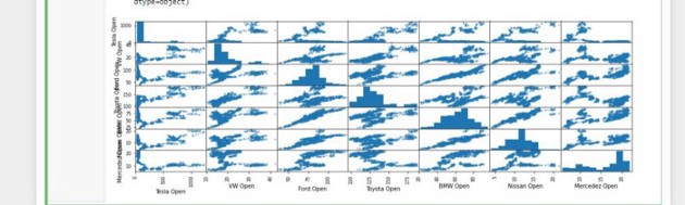
Stock prices can be viewed as random variables, now scatter matrices can determine if there is a linear correlation with one or more variables. So it simply shows us the correlation and relation between different types of data.
At some point, BMW and Nissan are related, also Ford and Nissan. Linear, histograms, curves etc we looking for similar diagrams at a certain point.
When a plot looks like a line we say that there is probably some correlation going on, the more the points are clustered on a straight line, we say have a perfect correlation.
And when we have strange curves and less straight lines, we say we have less correlation between the variables(in our case car manufacturers).
Candle Stick Charts
We now want to get a bit fancy and plot candlestick charts, with these glamourous charts we can see the open, close, high and low all in one chart.
We will start by bringing in the mpl_finance library and bring in the candlestick library.

There will be a warning, just ignore it and run the import again, then all will be normal.
And from matplotlib we will need the following modules;
DateFormatter, date2num, WeekdayLocator, DayLocator and lastly Monday.

We will now use Toyota as our sample, you can do the rest on the Notebook I have supplied.

We are only interested in the December information, from the 1st of December 2021 to currently.

Then we will create a new column and call it date accessed(date_acc) and we will apply a lambda function that converts a date to a number. We will also take the values of the opening values;
‘Date accessed’, ‘Opening Values’, ‘High Prices’, ‘Low Prices’, ‘Close Values’.

Green means gain and red means loss.
Daily Percentage Change
The daily percentage change can be represented by the following formulae:
rt =Pt/Pt-1 -1
rt is the return at sub t
Pt is the Price at time T
Pt-1 is the price at time T-1
What the rt value report is a percentage gain or loss. Say you bought the stock on day t-1 and you sold it at day t. If you gained then Pt should be grater than Pt-1. So the ratio should be greater than 1 and hence rt would be positive.
The larger the value of rt the better the price of t. But if you bought a stock at day t-1 and you sold it for a lower price, then our ratio would be less than 1 and rt would be negative. The smaller the value of rt, the more loss we have experienced.
This is used mainly to analyze the volatility of the stock, if the daily returns have a wide distribution, the stock is more volatile. We will be calculating the percentage return and plot them on a histogram.
These histograms will help us see which is the more stable and which is the more volatile. Most investors fear volatility, they want stability.
We will represent our formula as code, using;


The first term has NAN as there is nothing before it, hence it is not divisible by anything. Let’s do the same for the others and plot everything on a histogram.


So we plot out the histogram using the .hist method and we specify the number of bins we want. The thicker our histogram is the more volatile the stock is.
The width of the histogram shape is related to the standard deviation of the distribution. The higher it is the more variants we have, the variants of a certain distribution are directly related to the standard deviation. It’s actually the square value of the standard deviation, the higher the standard deviation is, the higher the variance is. The more volatility we have in terms of stock analysis.
Let’s do the same for the other car manufacturers and even better yet, analyze them on the same graph.


One histogram is covering the other, so we can set transparency called alpha and enlarge the figure.

The enlarged diagram shows Tesla, Ford and VW with a wider curve, hence we can see that these stocks are more volatile than that of the others. To smoothen this down we will use the KDE(Kernel Density Estimate).
The KDE takes in a histogram and tries to fit a certain kernel.


I the graph some companies are shorter such as Tesla, it is taller on the histogram but shorter on the KDE. Well, we are using a kernel, which tells us a certain probability function.
The histogram is not normalized, whilst the KDE is, the areas of each density are constant, hence the two methods can be used for comparison. We still see that Tesla, Ford and VW are still fatter, this definitely confirms that the stock is volatile.
Box Plots
Also another useful tool you can use for information representation. We will call the pandas box method.


The daily percentage change of Tesla, Toyota and Mercedes is taller than the others, this means those stocks are more volatile.
Cumulative Return
The formulae for this goes as follows; it = (1 + rt)it-1, this is a recursive formula, hence we have the name cumulative return.
We multiply ‘it-1’ with the factor of ‘1+rt’, rt was used earlier on and it is called the daily percentage change. Cumulative returns are the answer to the question all investors ask.
You invest $100 in a car manufacturer at the beginning of your time series. The most important question here is how much would it be worth today. So in 2015, I invested $100 in BMW, how much did the dollar make me from then till now?
Our formula only calculated daily return and will not consider a stock that has dividends. Cumulative return is computed the day investment was made, if the cumulative return is above 1, then you are making profit. We can compute this, using the following;


The first entry is always $1 as you can see on the tables the values are close to 1, so the cumulative return is always compared to 1 dollar. So which stock showed the highest return for $1 invested? Clearly, the graphs show for some companies $1 dollar in 2015 is now worth $25 in 2021.
Additional Reading
https://colab.research.google.com/drive/1gSih6aUzJLG39tHh6EZRvDg7FqfJnUc5?usp=sharing
Share with your friends and followers
Start blogging about your favorite technologies, reach more readers and earn rewards!
Join other developers and claim your FAUN account now!

The Maths Geek 🤓
@thenjikubheka
User Popularity
619
Influence
62k
Total Hits
22
Posts


Read, Learn, Know, Teach
Hand curated newsletters for Developers, private Slack with like minded people, podcasts, job offers, news and more!

Only registered users can post comments. Please, login or signup.