


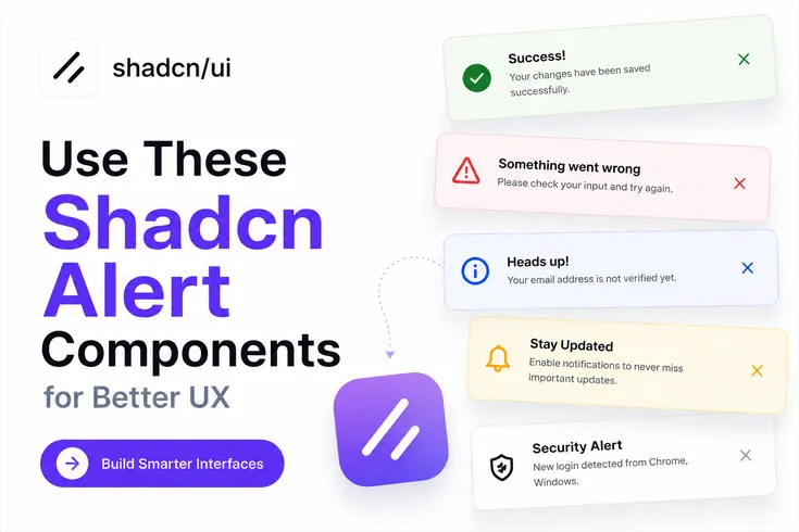
Alerts are one of the most overlooked UI patterns in modern applications.
Most developers spend hours building forms, authentication flows, dashboards, and settings pages, but users still get confused when there is no clear feedback after an action. A save button is clicked, an API request finishes, or a validation fails, yet the interface stays silent.
That's where well-designed alert components help. They make user actions visible, reduce confusion, and improve the overall experience without adding complexity to your codebase.
For this guide, I reviewed the best available Shadcn Alert Components and evaluated them based on:
Real-world developer use cases
Reusability across SaaS and dashboard applications
Accessibility considerations
UI clarity
Installation experience
Compatibility with modern React applications
All components in this list are open source, built with React and Tailwind CSS, support Radix UI primitives, support Base UI, and can be installed using the official CLI.
What are Shadcn Alert Components?
Shadcn Alert Components are reusable UI blocks designed to display important information, warnings, errors, success states, and system feedback inside React and Next.js applications.
Instead of creating notification layouts from scratch every time, you can use pre-built alert patterns that already follow modern UI practices. This helps keep feedback consistent across forms, dashboards, onboarding flows, authentication screens, and admin panels.
A good react alert component does more than show a message. It provides context, highlights priority, guides the next action, and helps users understand what happened after interacting with your application.
For developers building SaaS products, analytics dashboards, internal tools, admin systems, or customer portals, alerts become a core part of the user experience because they communicate system status without interrupting workflows.
Why Developers Use Shadcn Alerts
Alerts solve a simple but important problem.
Users need feedback.
When someone updates profile settings, resets a password, accepts an invitation, submits a form, or completes a payment, they expect confirmation. If the interface provides no feedback, users often repeat actions or assume something failed.
Modern Shadcn Alert Components help you:
Display validation feedback
Surface API errors
Show success states
Highlight warnings
Communicate system updates
Guide user actions
Because these shadcn components are built using Radix UI-compatible patterns and support Base UI implementations, they fit naturally into modern React codebases.
Developer Checklist Before Using Alert Components
Before adding any alert component to production, check these items:
| Checklist Item | Description |
|---|---|
| Show alerts only when users need feedback | Display alerts only when they provide useful information or guidance to the user. |
| Keep messages specific and actionable | Write clear messages that explain the issue and what users can do next. |
| Match alert severity with visual styling | Use appropriate colors, icons, and styles to reflect the alert's importance (info, success, warning, error). |
| Avoid stacking multiple alerts simultaneously | Prevent overwhelming users by showing only the most relevant alert at a time. |
| Place alerts close to the related action | Position alerts near the feature, form, or action they refer to for better context. |
| Include meaningful titles and descriptions | Provide concise titles and supporting details that help users understand the alert. |
| Test alert visibility in light and dark modes | Ensure alerts remain readable and visually distinct across different themes. |
| Verify keyboard accessibility | Confirm users can navigate to, interact with, and dismiss alerts using only a keyboard. |
| Validate mobile responsiveness | Check that alerts display correctly and remain usable on different screen sizes. |
| Ensure alerts work with asynchronous API states | Verify alerts correctly handle loading, success, error, and retry scenarios from API interactions. |
Key Benefit: Applications that use clear feedback patterns generally create fewer support requests because users understand what happened after an action.
Install Shadcn Alert Components
All alert components can be installed using the official CLI.
PNPM
pnpm dlx shadcn@latest add @shadcn-space/alert-01
NPM
npx shadcn@latest add @shadcn-space/alert-01
Yarn
yarn dlx shadcn@latest add @shadcn-space/alert-01
Bun
bunx shadcn@latest add @shadcn-space/alert-01
Top Loved Shadcn Alert Components
The current collection includes 6 production-ready alert variations designed for different user feedback scenarios.
Before choosing one, think about the type of feedback your application needs to communicate. Some alerts work best for validation, while others are better for notifications, warnings, or action-driven messages.
Alert with Password Detail
This alert is designed for password validation and authentication flows. Instead of showing a generic validation error, it displays specific password requirements such as minimum length, uppercase letters, lowercase letters, and other rules. This reduces user frustration because the next action is immediately clear.
Use Cases:
User registration forms
Password reset screens
Account onboarding
Enterprise authentication portals
Security settings pages
Best for: Password creation and account security flows.
Alert with User Detail
This component displays user-related activity directly inside the alert. It works well when you need to show unread messages, mentions, comments, replies, or collaboration updates without forcing users to navigate away from their current screen.
Use Cases:
Project management apps
Collaboration tools
Internal communication platforms
Creator dashboards
Community platforms
Best for: Team collaboration and activity feeds.
Social Alert
Social Alert focuses on user interaction feedback. It can communicate actions such as connection requests, invitations, follows, approvals, or social engagement events. The layout keeps interactions visible while maintaining a lightweight footprint inside the interface.
Use Cases:
Networking platforms
Community products
Creator tools
Referral systems
User engagement dashboards
Best for: Social features and engagement workflows.
Indicator Destructive Alert
This alert is designed for high-priority warnings and destructive states. It immediately draws attention to problems such as exhausted credits, failed operations, expired subscriptions, billing issues, or permission restrictions. The visual indicator makes it suitable for situations where users must take action quickly.
Use Cases:
SaaS billing systems
Credit-based platforms
Subscription management
Admin dashboards
Usage monitoring screens
Best for: Critical warnings and operational failures.
Dark Alert
Dark Alert uses a darker visual style while preserving readability and hierarchy. It fits naturally into dark-themed dashboards and admin panels where standard alerts may feel visually disconnected from the surrounding interface.
Use Cases:
Analytics dashboards
Admin panels
Monitoring systems
Internal business tools
Developer platforms
Best for: Dark-mode applications and dashboard interfaces.
Gradient Alert
Gradient Alert adds stronger visual emphasis while still functioning as a standard alert component. This style works well when you need to communicate announcements, feature releases, onboarding guidance, or promotional information without creating a separate notification system.
Use Cases:
Feature launch notifications
Product updates
Onboarding flows
Customer education screens
Release announcements
Best for: Product announcements and feature communication.
Why These Alert Components Stand Out
Most alert libraries provide only basic success and error messages.
This collection offers six focused alert patterns that map directly to real product scenarios including authentication, collaboration, social engagement, billing warnings, dashboard notifications, and product announcements.
Because the components are built for React, Tailwind CSS, Next.js workflows, Radix UI compatibility, and Base UI support, they fit naturally into modern frontend projects without requiring heavy customization.
FAQs
1. Which Shadcn Alert Component is best for form validation and password requirements?
Alert with Password Detail is the best option for form validation because it displays specific password rules and validation requirements directly inside the alert. Users immediately know what needs to be fixed.
2. How do I install Shadcn Alert Components using pnpm, npm, yarn, or bun?
You can install any component using the official CLI command. Replace the component identifier with the alert variation you want to use, then run the command through pnpm, npm, yarn, or bun.
3. Are Shadcn Alert Components compatible with React, Next.js, Radix UI, and Base UI?
Yes. These alert components are designed for React and Next.js applications, support Radix UI patterns, and also work with Base UI implementations, making them suitable for modern frontend projects.
Final Verdict
If your application needs clear user feedback, alerts should not be treated as an afterthought.
The six alert components covered in this guide solve different communication problems, from authentication feedback and collaboration updates to destructive warnings and product announcements. Each one is designed around a specific user scenario instead of a generic notification layout.
For most SaaS products, dashboards, admin panels, and internal tools, Alert with Password Detail, Indicator Destructive Alert, and Dark Alert will likely cover the majority of production use cases. Social Alert and User Detail Alert become valuable when your product includes collaboration or community-driven workflows.
If you are building with React, Next.js, Tailwind CSS, Radix UI, or Base UI, these Shadcn Alert Examples provide a practical starting point that saves development time while keeping user feedback consistent across your application.


