


Creating a signup page sounds simple until you actually build one.
You need form validation, social authentication buttons, responsive layouts, accessibility support, dark mode compatibility, and a clean onboarding experience. Most developers end up rebuilding the same registration flow for every project.
That is why pre-built Shadcn register blocks have become popular in the React and Next.js ecosystem. Instead of spending hours designing and structuring signup pages, you can install a ready-made registration block and customize it for your application.
In this guide, I have reviewed the Shadcn Register Blocks and evaluated them based on the developer experience, onboarding flow, layout quality, responsiveness, customization flexibility, authentication support, and production readiness. These blocks are useful for SaaS products, developer tools, startup dashboards, AI applications, internal platforms, and modern web apps.
What is Shadcn Register?
A Shadcn Register Block is a pre-built signup page built using modern React technologies. It gives you a complete account creation flow without starting from scratch.
Instead of manually building form layouts, authentication sections, social login buttons, validation structures, and responsive containers, you can install a block and start customizing immediately.
These register blocks follow the same developer-first philosophy as shadcn/ui. You get full code ownership, complete customization control, and direct access to the source code.
These blocks are built with React, Next.js, Tailwind CSS, and Framer Motion, delivering a modern and flexible development experience. Every register block includes support for Radix UI and Base UI, along with fully responsive layouts optimized for mobile, tablet, and desktop devices.
They also feature light and dark mode compatibility, provide access to Figma design files, and support both CLI installation guide and a direct copy-and-paste workflow for seamless integration into your projects.
All blocks can be installed using the CLI command.
Example Installation
pnpm dlx shadcn@latest add @shadcn-space/register-01
You can also install using npm, yarn, or bun depending on your project setup.
Developer Checklist Before Choosing a Register Block
Before installing any signup shadcn component, check the following:
Supports React and Next.js
Works with Tailwind CSS
Compatible with Radix UI
Compatible with Base UI
Mobile responsive
Tablet responsive
Desktop responsive
Dark mode support
Social authentication support
Easy form validation integration
Full source code ownership
CLI installation support
Figma design availability
Easy customization structure
Production-ready layout
If a register block satisfies these requirements, it can usually be integrated into a modern application without major refactoring.
Best Shadcn Register Blocks or Examples
Discover the best Free and Premium Shadcn Register blocks and examples for building modern, responsive, and production-ready interfaces.
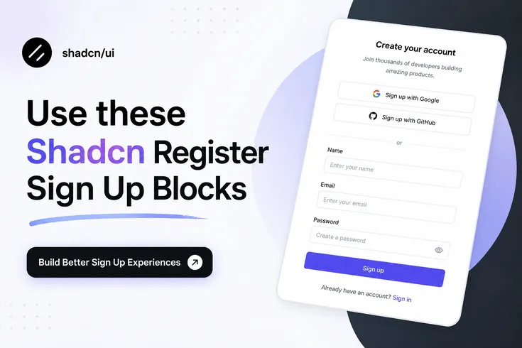
Simple & Secure Signup Page
This registration block focuses on reducing signup friction. It includes email registration, password fields, Google authentication, GitHub authentication, and a conversion-focused layout that works well for SaaS onboarding flows. The structure remains simple enough to customize while still providing everything required for production-ready account creation. It is also available as a free block, making it a practical starting point for new projects.
Use Cases
SaaS onboarding
Developer tools
AI applications
Startup products
Internal platforms
Best For: Fast account creation flows with social authentication.
Modern Analytics SignUp Page
This block uses a split-screen layout where the registration form appears alongside an application preview. The dashboard-style visual helps communicate product value before signup, making it useful for analytics platforms, reporting tools, SaaS dashboards, and data-heavy applications. The structure also creates a more polished first impression without increasing implementation complexity.
Use Cases
SaaS analytics platforms
Product dashboards
CRM applications
Monitoring systems
Business applications
Best For: SaaS products that want to showcase the application before registration.
Minimal Visual Split Register
This layout combines a registration form with a large visual section. The design creates stronger visual hierarchy while keeping the form itself lightweight and distraction-free. Social authentication options are included, and the layout works well when brand presentation is an important part of onboarding.
Use Cases
Startup landing pages
Portfolio platforms
Creative products
Community applications
Membership websites
Best For: Products that rely heavily on visual branding during onboarding.
Creative Studio Sign-Up
This block uses a dark interface combined with multiple authentication providers including Google, GitHub, X, and LinkedIn. It is designed for products that serve creators, agencies, designers, developers, and professional communities where social sign-in flexibility improves account creation speed.
Use Cases
Agency platforms
Creator tools
Design systems
Freelance marketplaces
Professional communities
Best For: Products requiring multiple social authentication options.
Modern Team Collaboration Sign-up
This register block introduces a collaboration-focused visual experience while maintaining a clean authentication workflow. The layout works particularly well for project management software, team communication products, workspace tools, and collaborative SaaS applications. It balances onboarding simplicity with stronger product storytelling.
Use Cases
Project management software
Team collaboration tools
Productivity platforms
Workspace applications
Team portals
Best For: Collaboration-focused SaaS products.
Minimal Dual-Panel Register
This layout follows a modern dual-panel structure that separates branding content from registration functionality. The design keeps user attention on account creation while still providing enough space for product messaging, onboarding benefits, or visual previews. It is suitable for products that want a clean enterprise-style signup experience.
Use Cases
Enterprise SaaS
B2B platforms
Admin dashboards
Internal tools
Customer portals
Best For: Professional applications requiring a structured onboarding experience.
Why Shadcn Register Blocks Work Well for Modern React Projects
Traditional UI kits often lock developers into specific architectures.
Shadcn sign up blocks follow a different approach. The code lives inside your project, giving you complete control over authentication flows, styling, validation logic, API integration, and future maintenance.
This approach works particularly well for Next.js applications, SaaS products, AI tools, startup MVPs, developer platforms, customer portals, and internal business applications, making it a versatile solution for a wide range of modern web projects.
Frequently Asked Questions
1. What is the best Shadcn register block for a SaaS application?
If you are building a SaaS product, the Modern Analytics SignUp Page and Modern Team Collaboration Sign-up are strong choices because they combine account creation with product previews that help users understand the platform before completing registration.
2. Can I use Shadcn register blocks with Next.js, React, and Tailwind CSS?
Yes. These register blocks are built using React, Next.js patterns, Tailwind CSS, and modern frontend practices. You can install them through the CLI and customize the code directly inside your project.
3. Do Shadcn register blocks support Radix UI, Base UI, dark mode, and mobile responsiveness?
Yes. The register collection supports Radix UI and Base UI implementations, responsive layouts for mobile, tablet, and desktop screens, light and dark themes, Figma design files, and direct installation through pnpm, npm, yarn, or bun.
Final Verdict
A signup page is often the first real interaction users have with your product.
A poorly structured registration flow can create friction before users even reach your application. A well-designed signup experience improves onboarding, reduces drop-offs, and creates a better first impression.
The Shadcn Register components provides multiple approaches depending on the type of product you are building. Some layouts focus on simplicity, while others combine onboarding with product previews, collaboration messaging, or multi-provider authentication.
The biggest advantage is developer ownership. Every block includes source code access, Figma design support, responsive layouts for mobile, tablet, and desktop devices, light and dark mode compatibility, support for Radix UI primitives and Base UI components, and installation through pnpm, npm, yarn, or bun using the official CLI workflow. This makes customization significantly easier compared to traditional UI kits.
If your goal is to launch a modern React or Next.js application faster, these register blocks provide a practical starting point while still giving you complete control over the final implementation.


